The Showroom
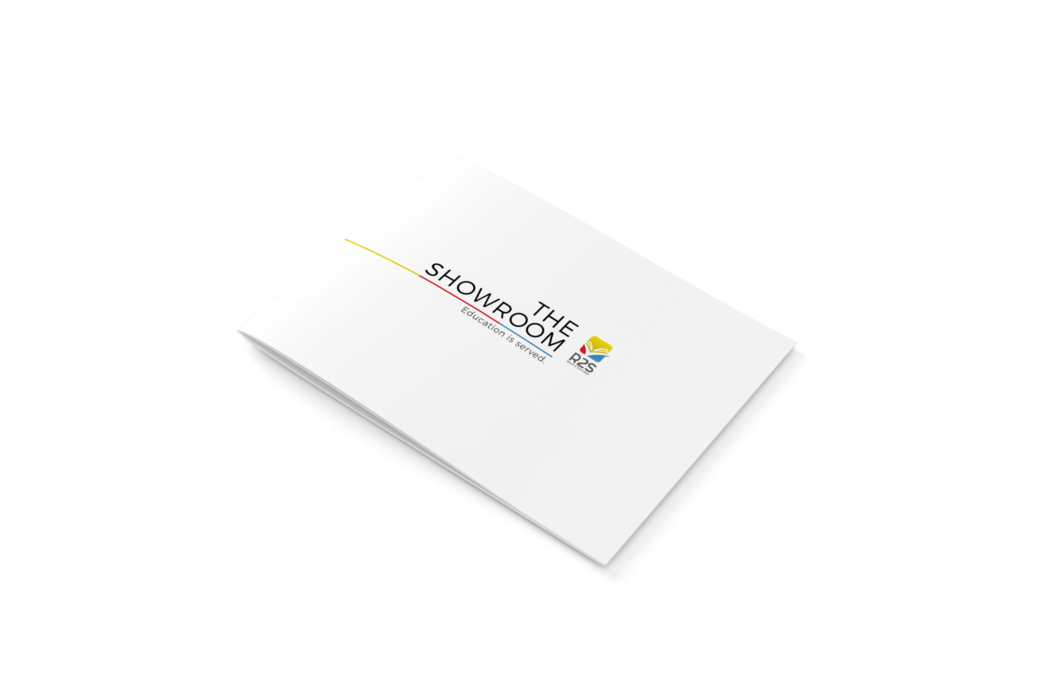
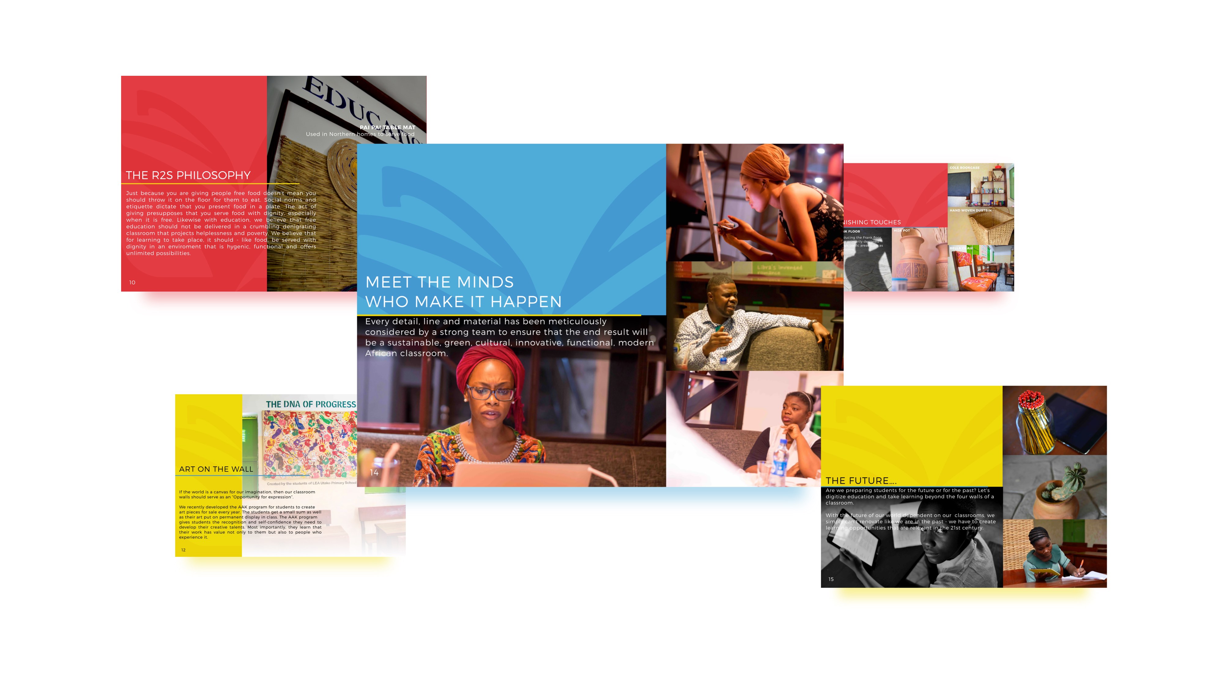
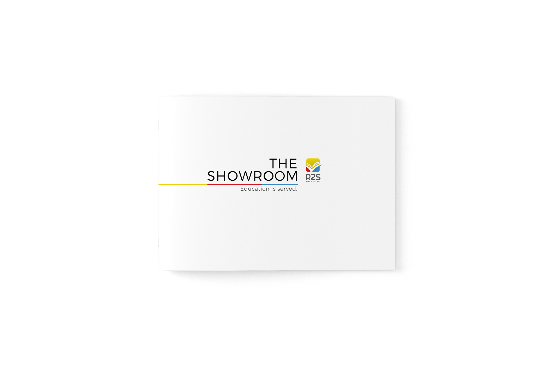
We designed the brochure for Project Read2Succeed, a non-profit organization that seeks to improve the literacy level amongst children in public primary schools.
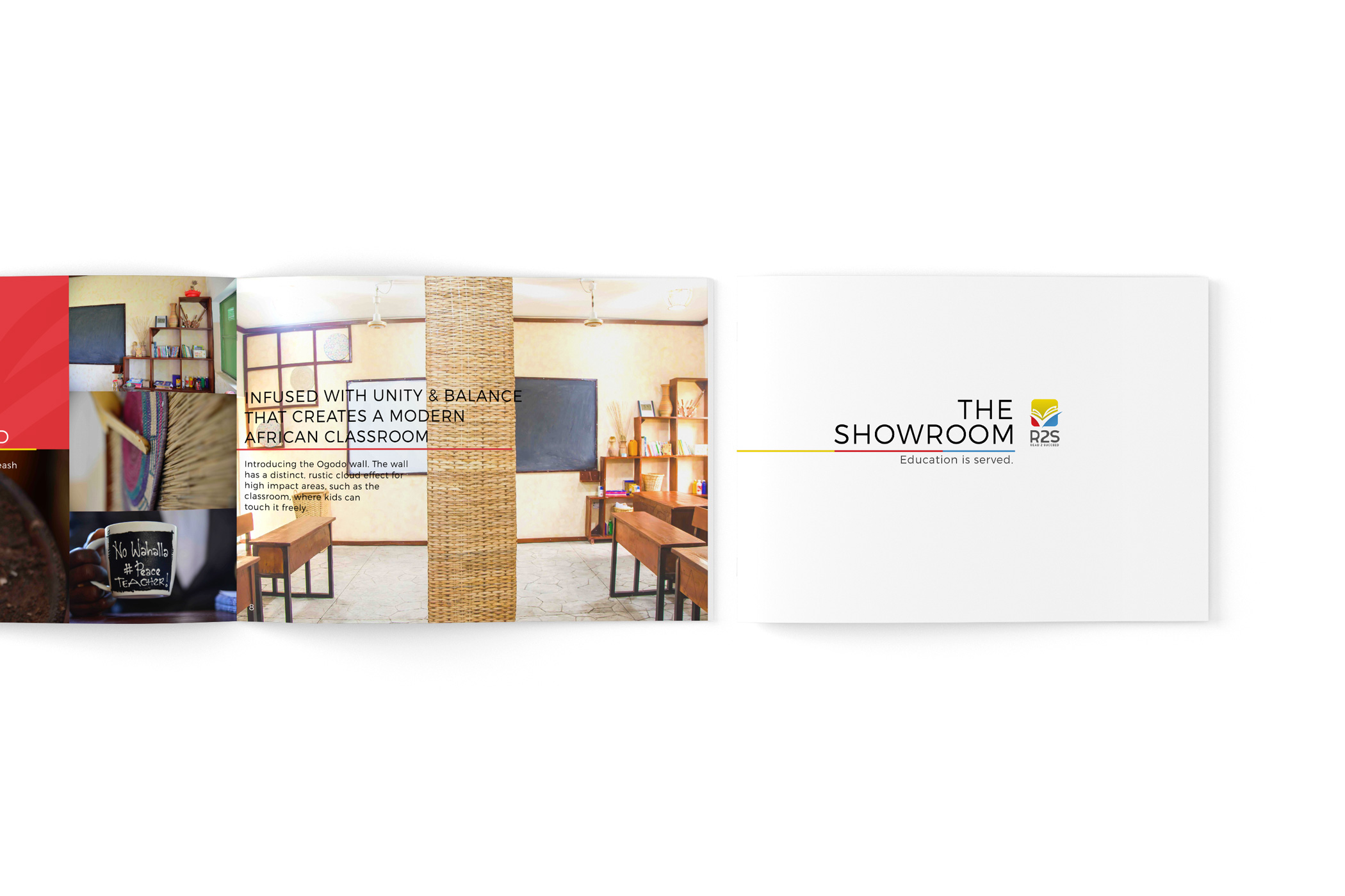
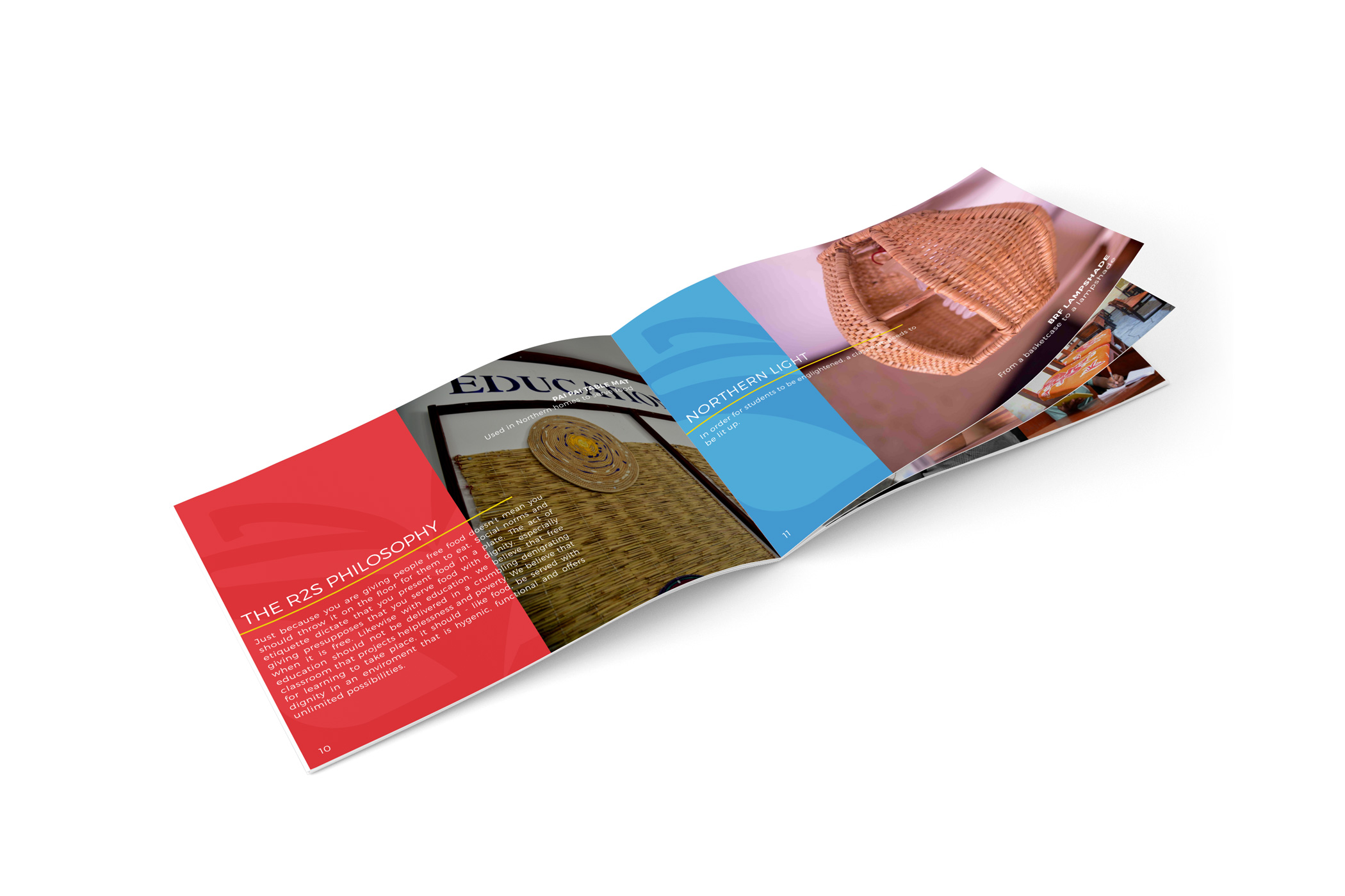
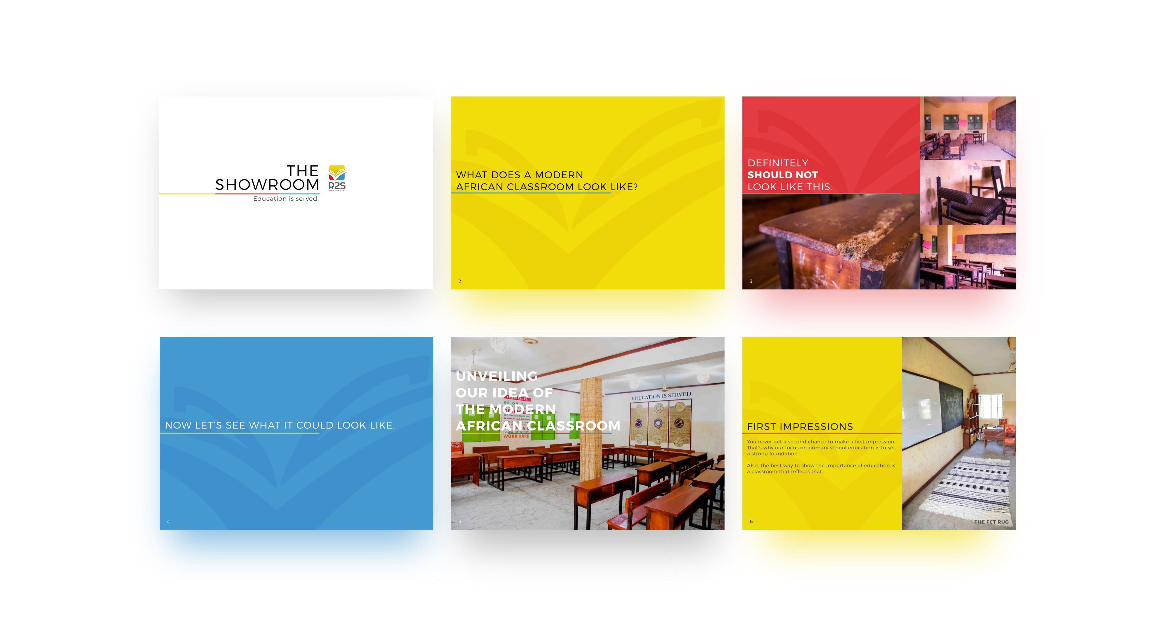
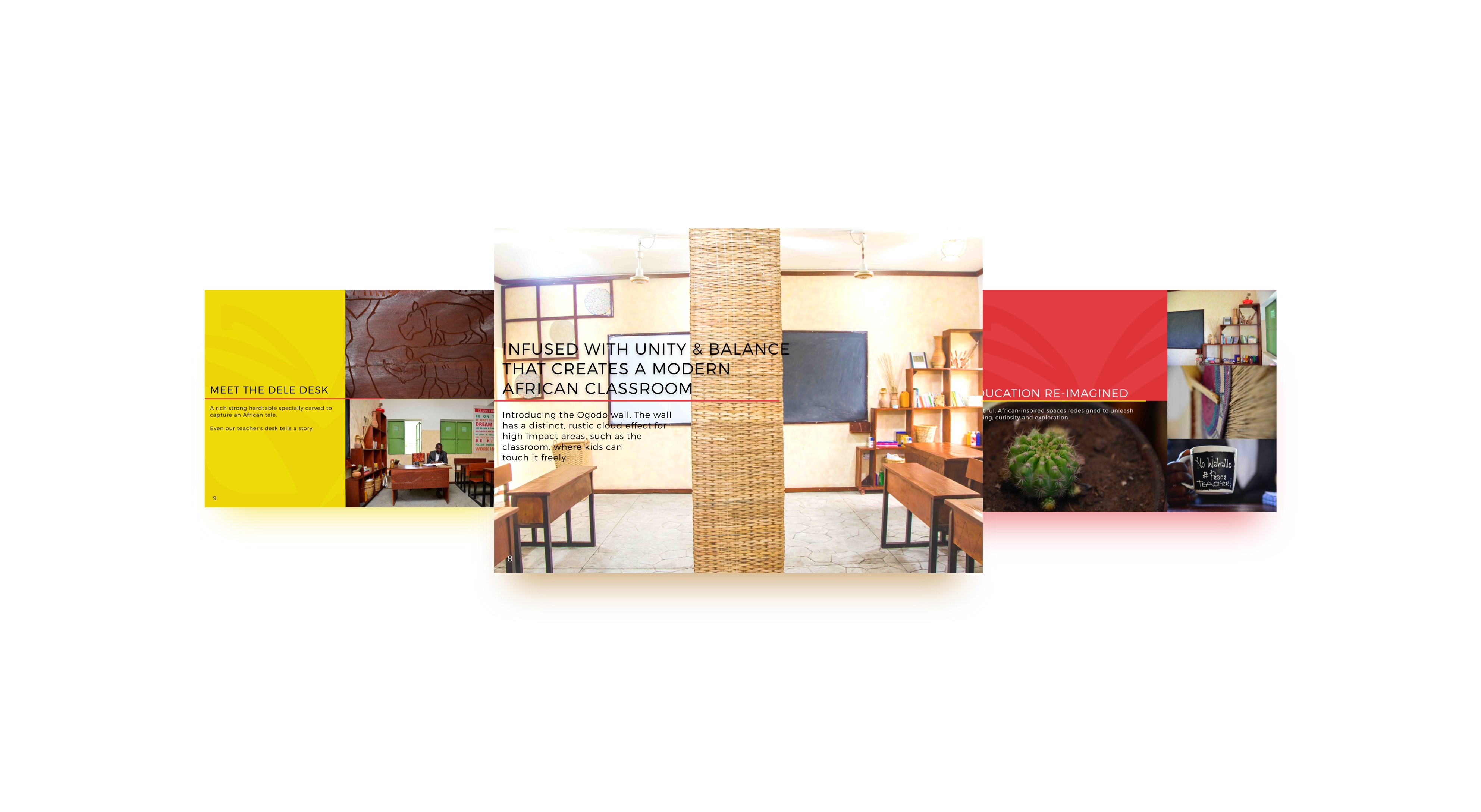
It features bright vivid colors derived from the logo of Project Read2Succeed, along with secondary colors that are overlaid derivates of the primary colors.
The line at the mid-left signifies the distinction between the positive effects of learning through the R2S process and what is currently executed by default. It also adapts to the organization’s color while serving as a stable visual cue for where readers are to refer to for text., which consistently features in the left margin.
The goal was to make a design that could fulfill its role effectively in both electronic forms as a slide and physical form as a brochure. It was also essential that the rich color and simple state introduced in the classroom could be reflected in the brochure.