HERI Development Ltd is a residential, commercial & infrastructure real estate development company.
When asked, “if your customers had to describe your company in one word, what would it be and why?” They answered, “‘Delivers.’ We want to be known to effectively and efficiently deliver projects.”
Mentioning that they appreciate minimalism, much like we do, they didn’t want a regular construction/real estate logo. They love clean line art like the new Juventus logo and our logo.
HERI Development Ltd.
HERI Development Ltd is a residential, commercial & infrastructure real estate development company.
When asked, “if your customers had to describe your company in one word, what would it be and why?” They answered, “‘Delivers.’ We want to be known to effectively and efficiently deliver projects.”
Mentioning that they appreciate minimalism, much like we do, they didn’t want a regular construction/real estate logo. They love clean line art like the new Juventus logo and our logo.
Approach
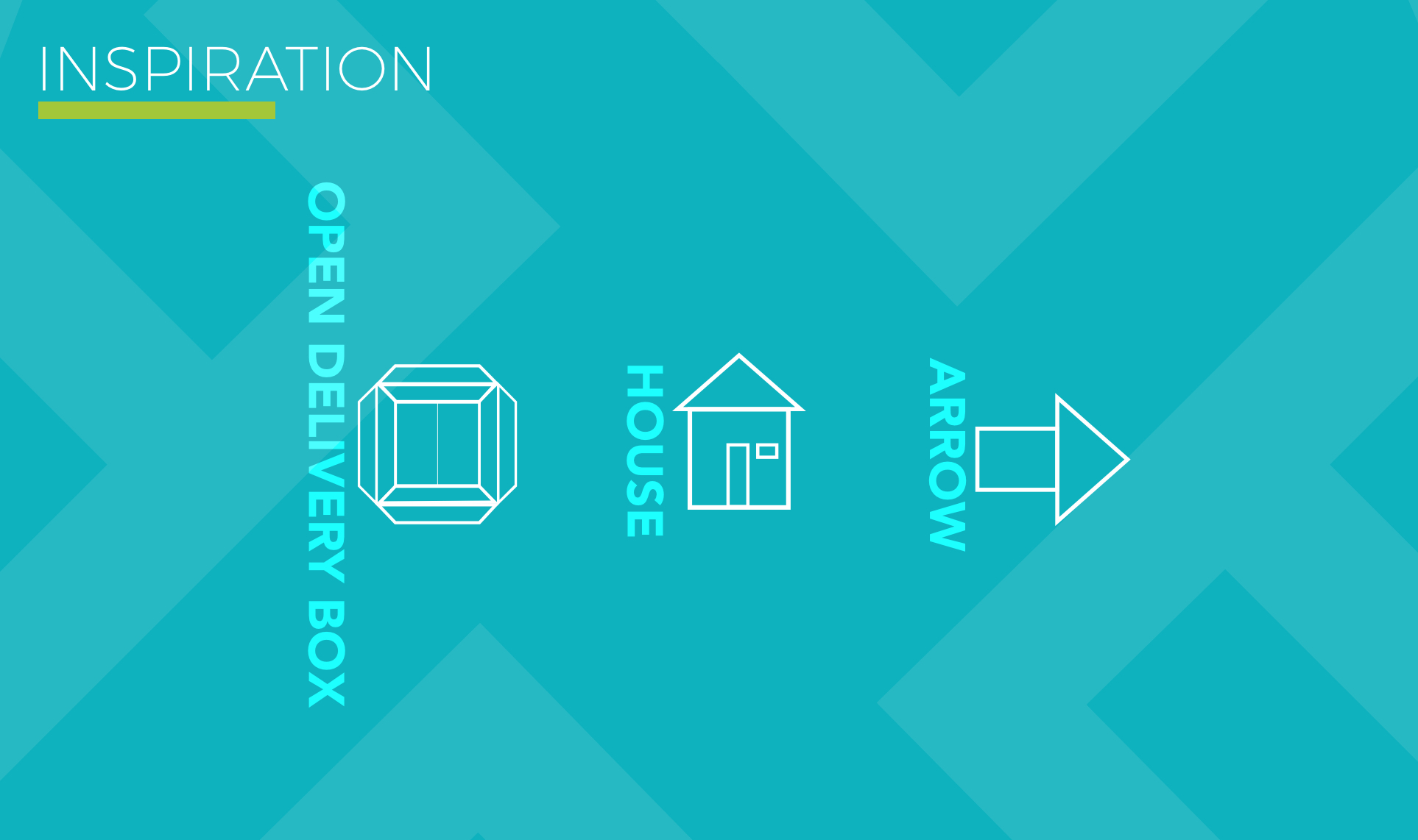
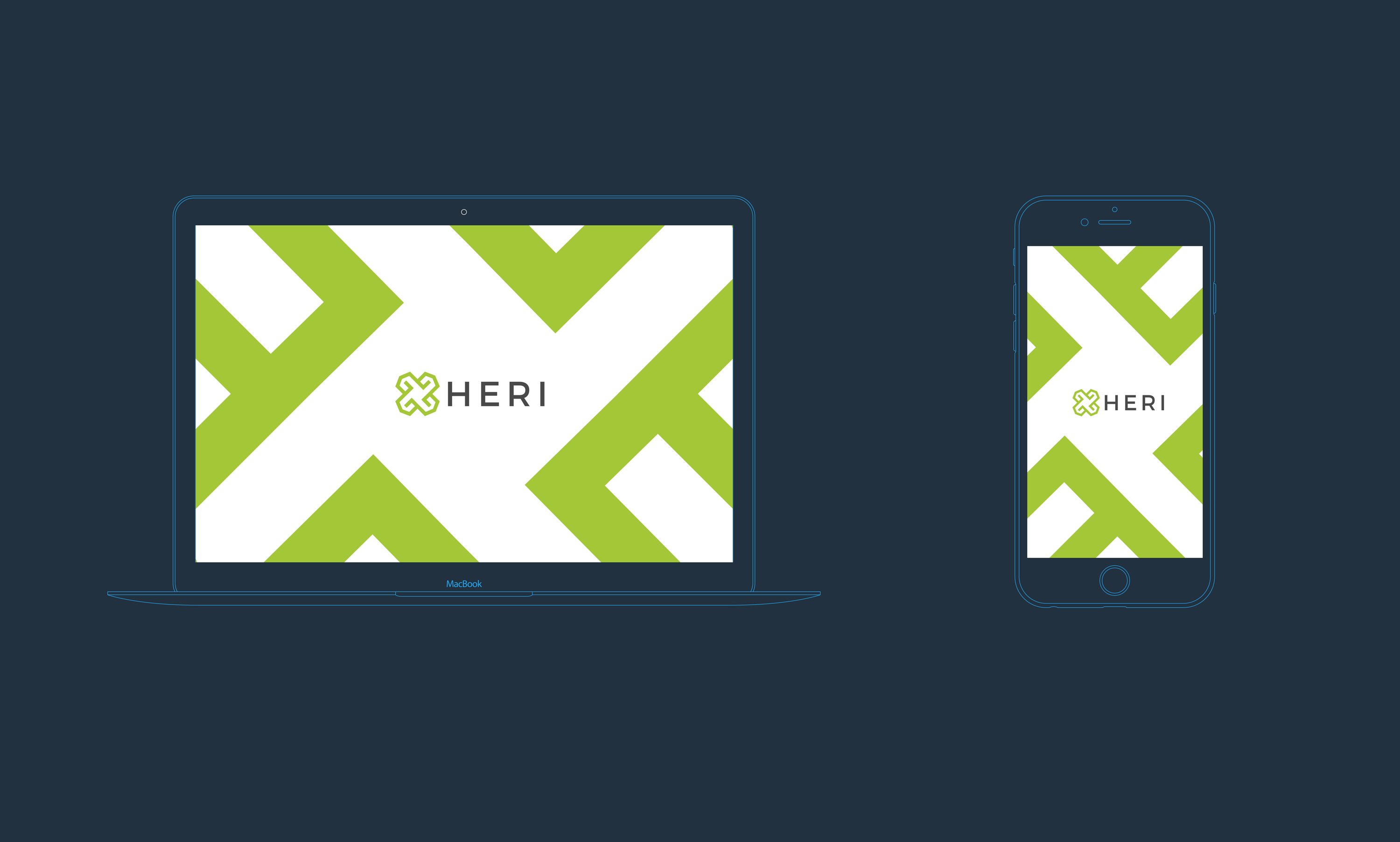
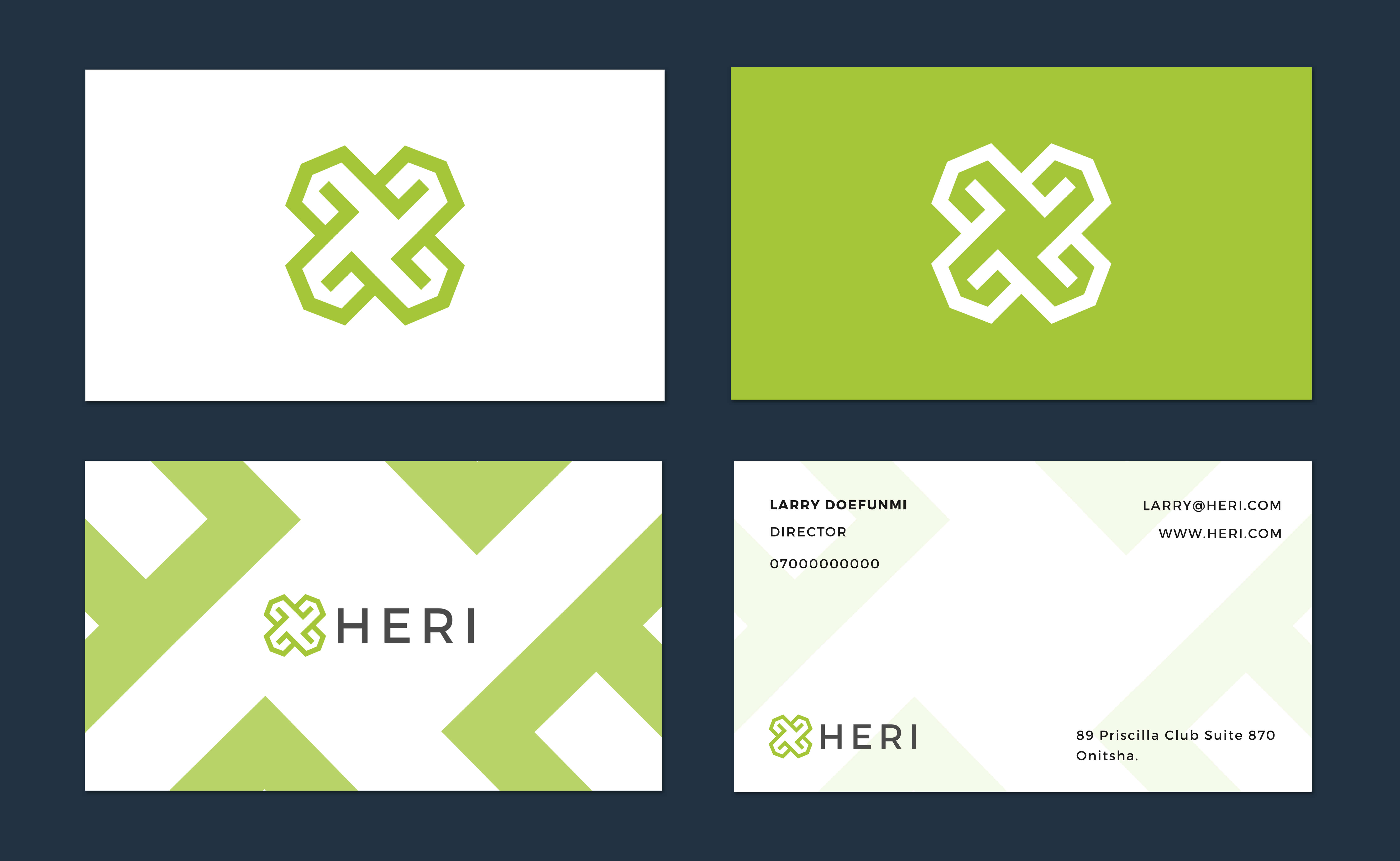
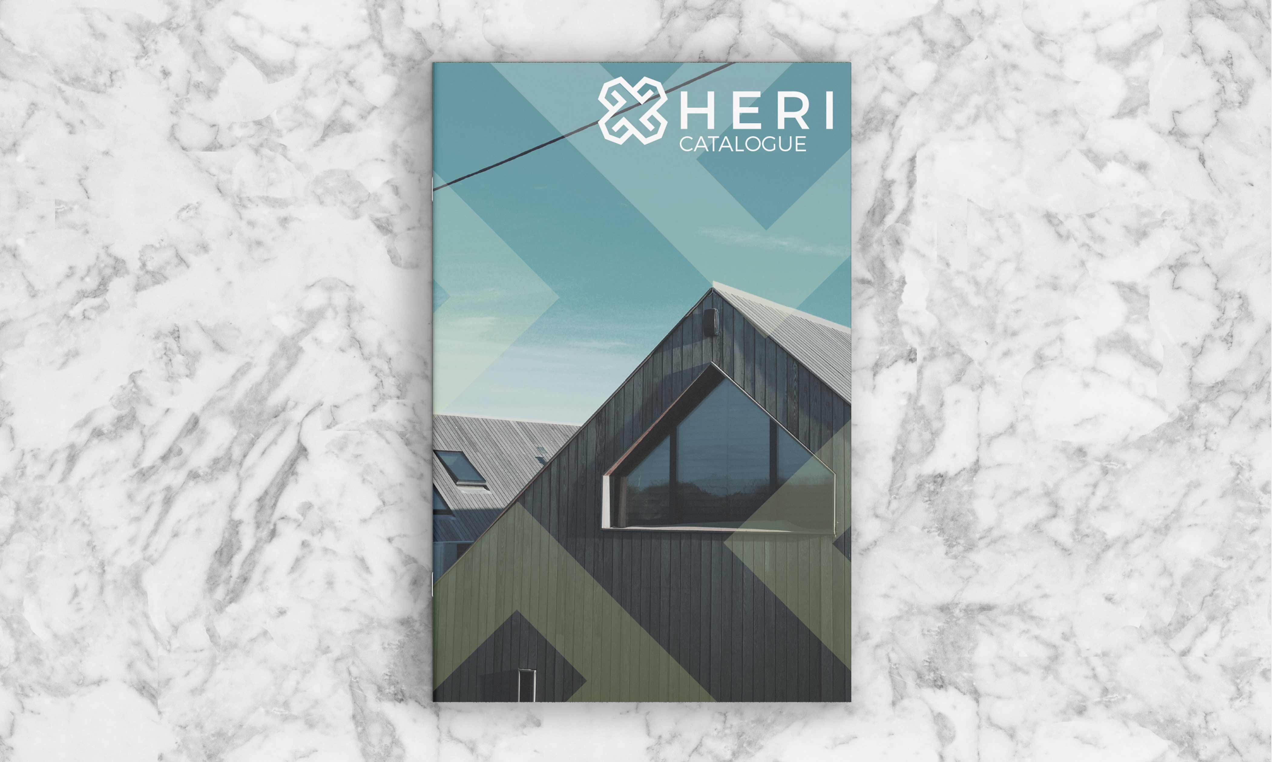
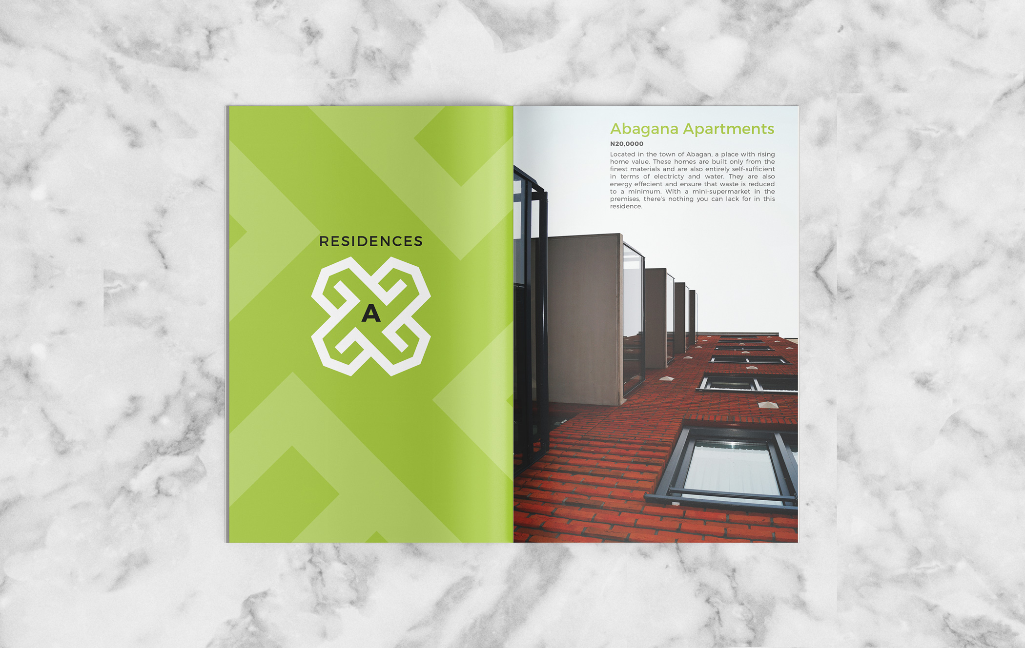
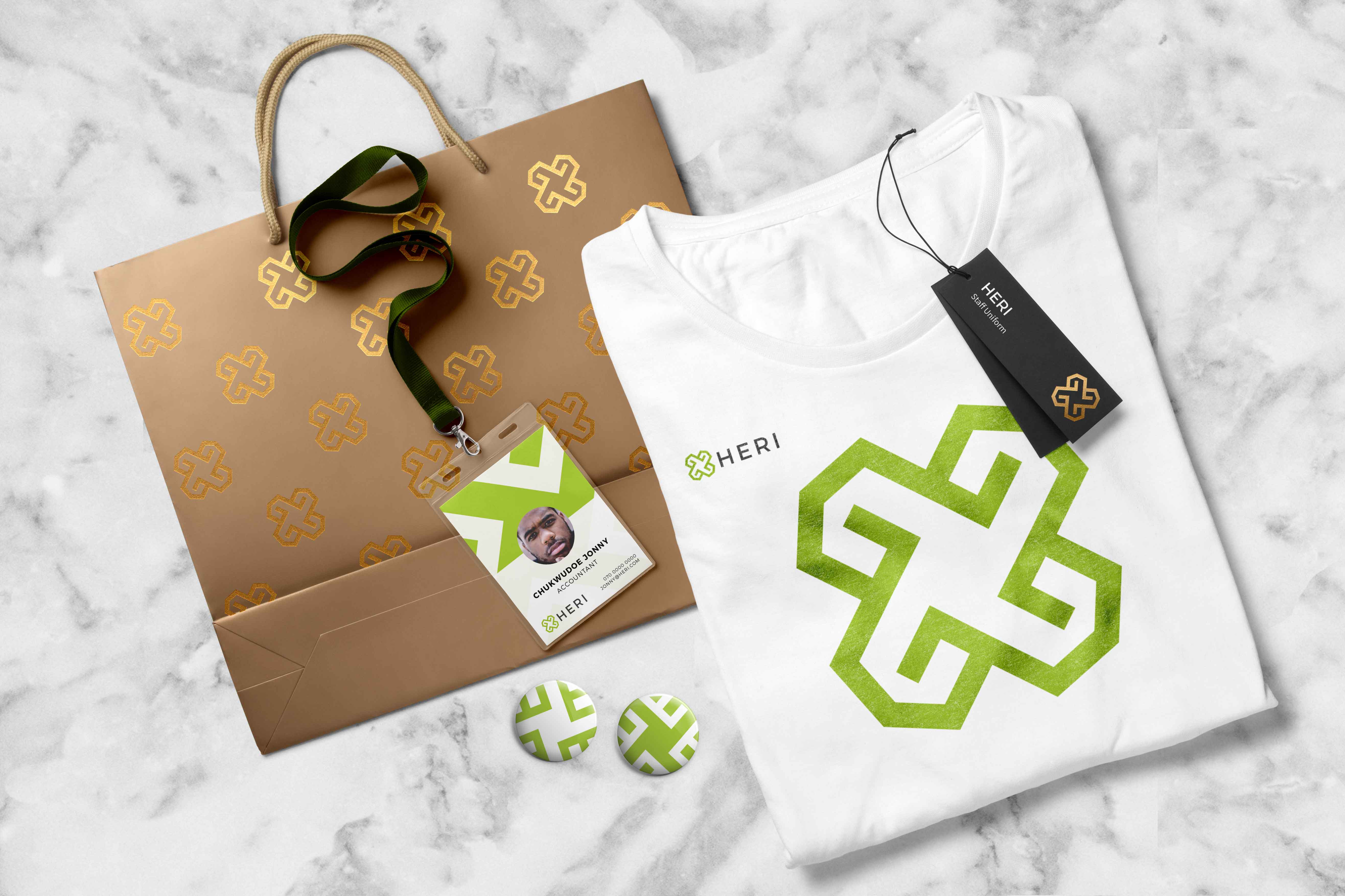
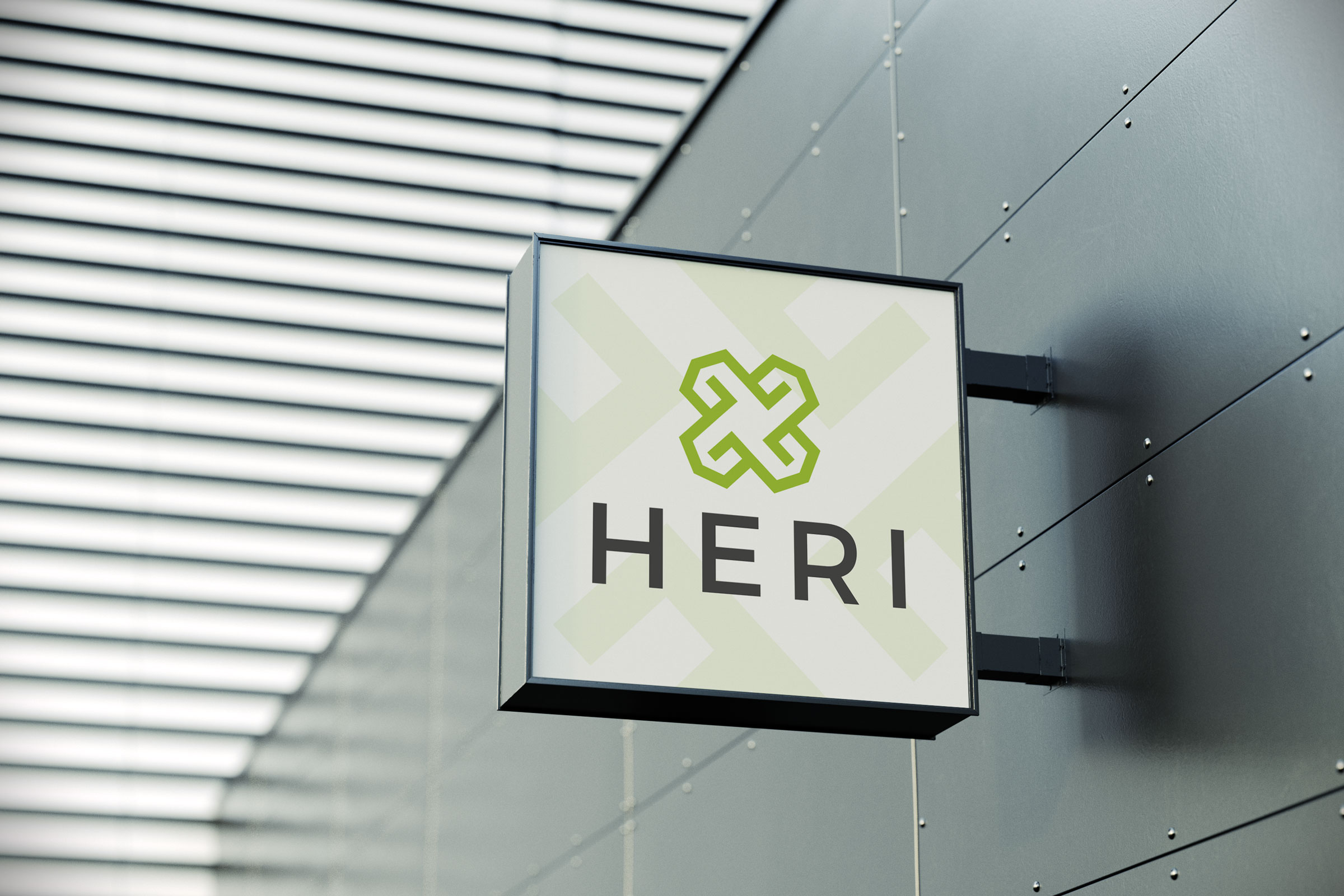
We designed an identity that reflects HERI’s goal to be known as a real estate development company that effectively and efficiently delivers on projects. We did this by drawing inspiration from delivery boxes, a minimalist depiction of a house/home structure and an arrow.
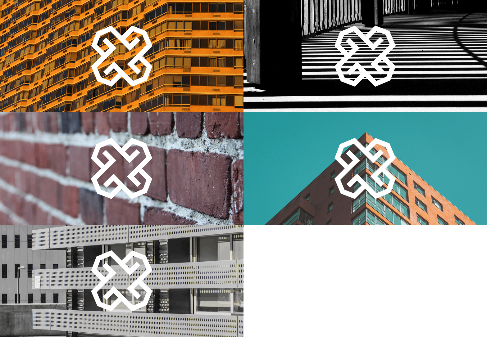
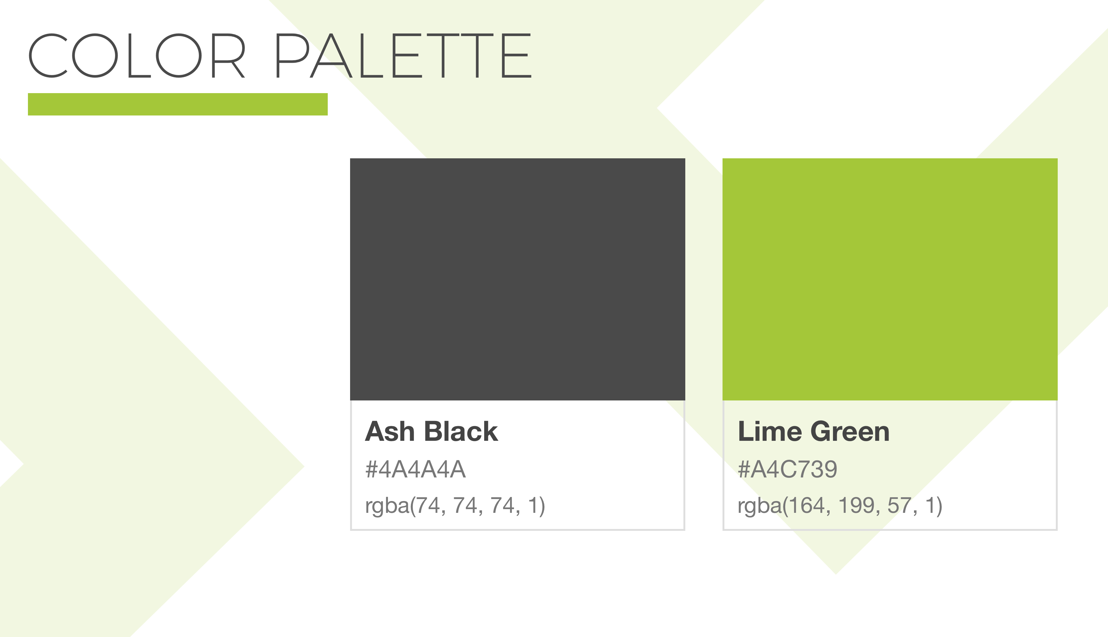
The logo features four houses (each house for each letter of their name) merged in a complimentary manner that also depicts a package that has been successfully delivered and opened by the client. Each house is also an arrow that depicts HERI’s ability to effectively deliver in any direction and manner expected. We chose green as it represents growth, the product of any company that puts delivering effectively and efficiently, first.
Approach
We designed an identity that reflects HERI’s goal to be known as a real estate development company that effectively and efficiently delivers on projects. We did this by drawing inspiration from delivery boxes, a minimalist depiction of a house/home structure and an arrow.
The logo features four houses (each house for each letter of their name) merged in a complimentary manner that also depicts a package that has been successfully delivered and opened by the client. Each house is also an arrow that depicts HERI’s ability to effectively deliver in any direction and manner expected. We chose green as it represents growth, the product of any company that puts delivering effectively and efficiently, first.