YouthHub Africa is a non-profit that organizes programs around youth development. They profile opportunities for youth and lead advocacy for girls/female education in Nigeria. They are also an online community that seeks to create a platform for young Africans involved in social change to interact, learn and collaborate.
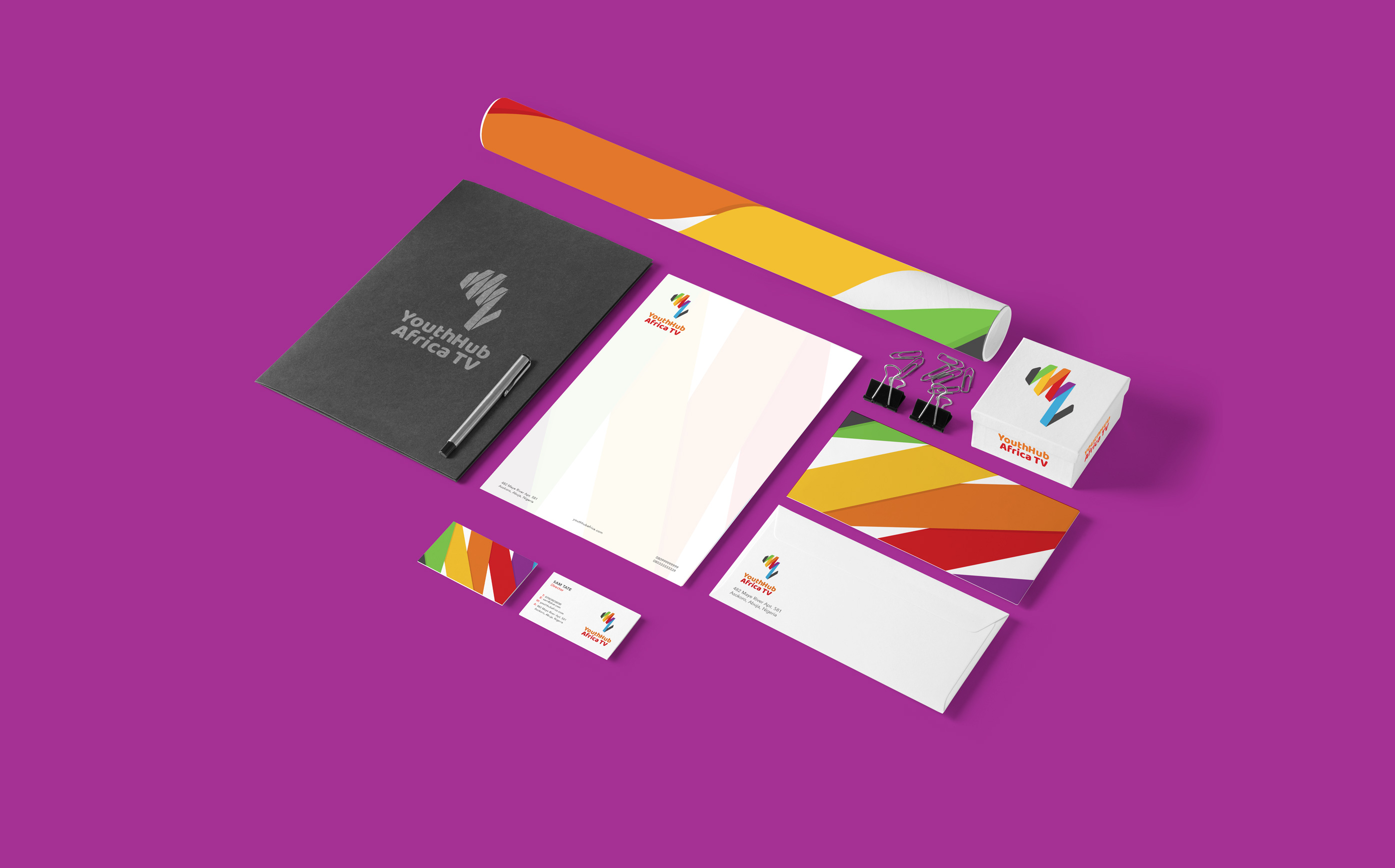
Youthhub Africa needed an identity for their latest project, Youthhub Africa TV – an online platform that develops content for young Africans in the form of web series, discussion programs and documentaries.
YouthHub Africa
YouthHub Africa is a non-profit that organizes programs around youth development. They profile opportunities for youth and lead advocacy for girls/female education in Nigeria. They are also an online community that seeks to create a platform for young Africans involved in social change to interact, learn and collaborate.
Youthhub Africa needed an identity for their latest project, Youthhub Africa TV – an online platform that develops content for young Africans in the form of web series, discussion programs and documentaries.
Approach
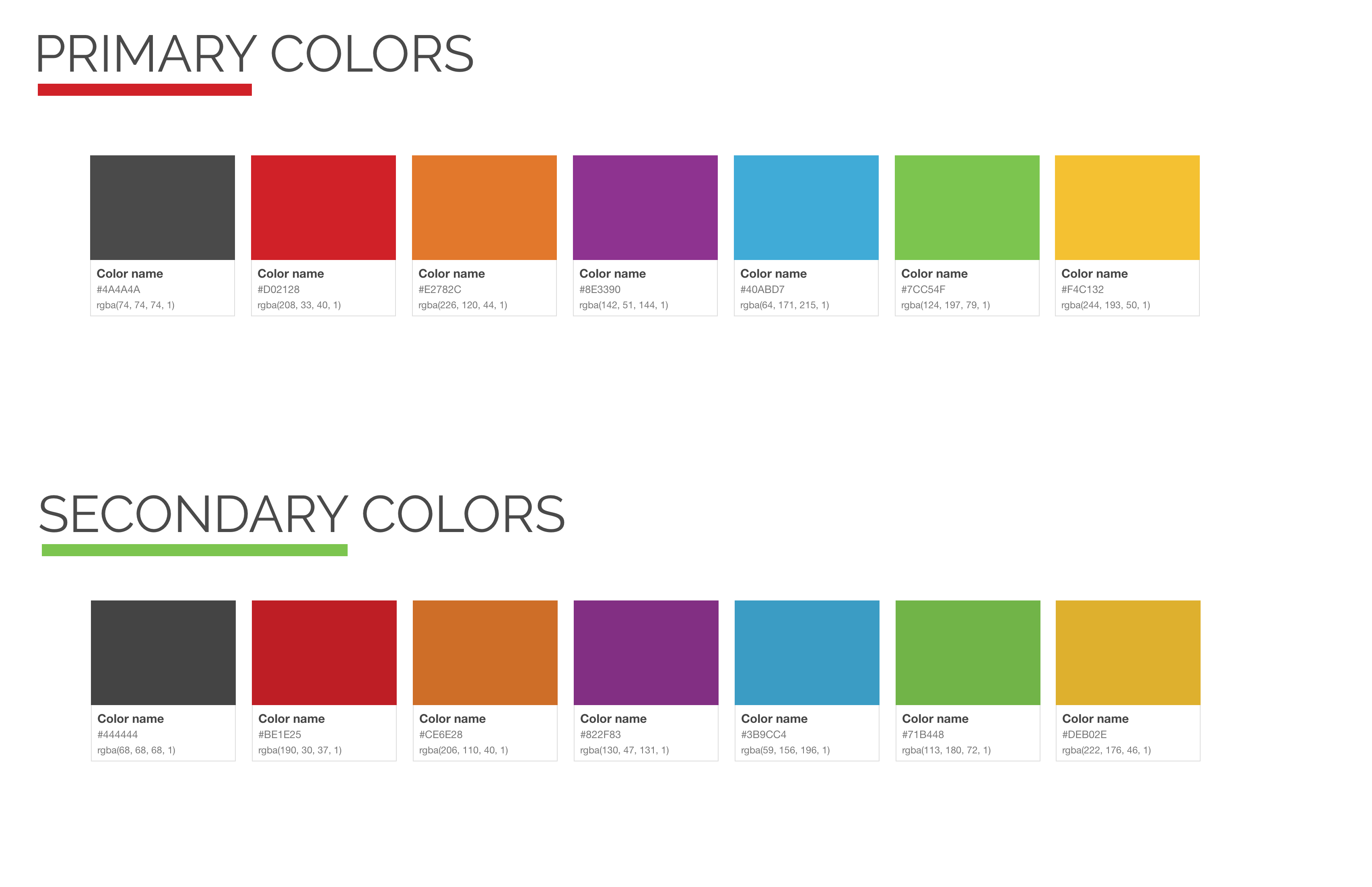
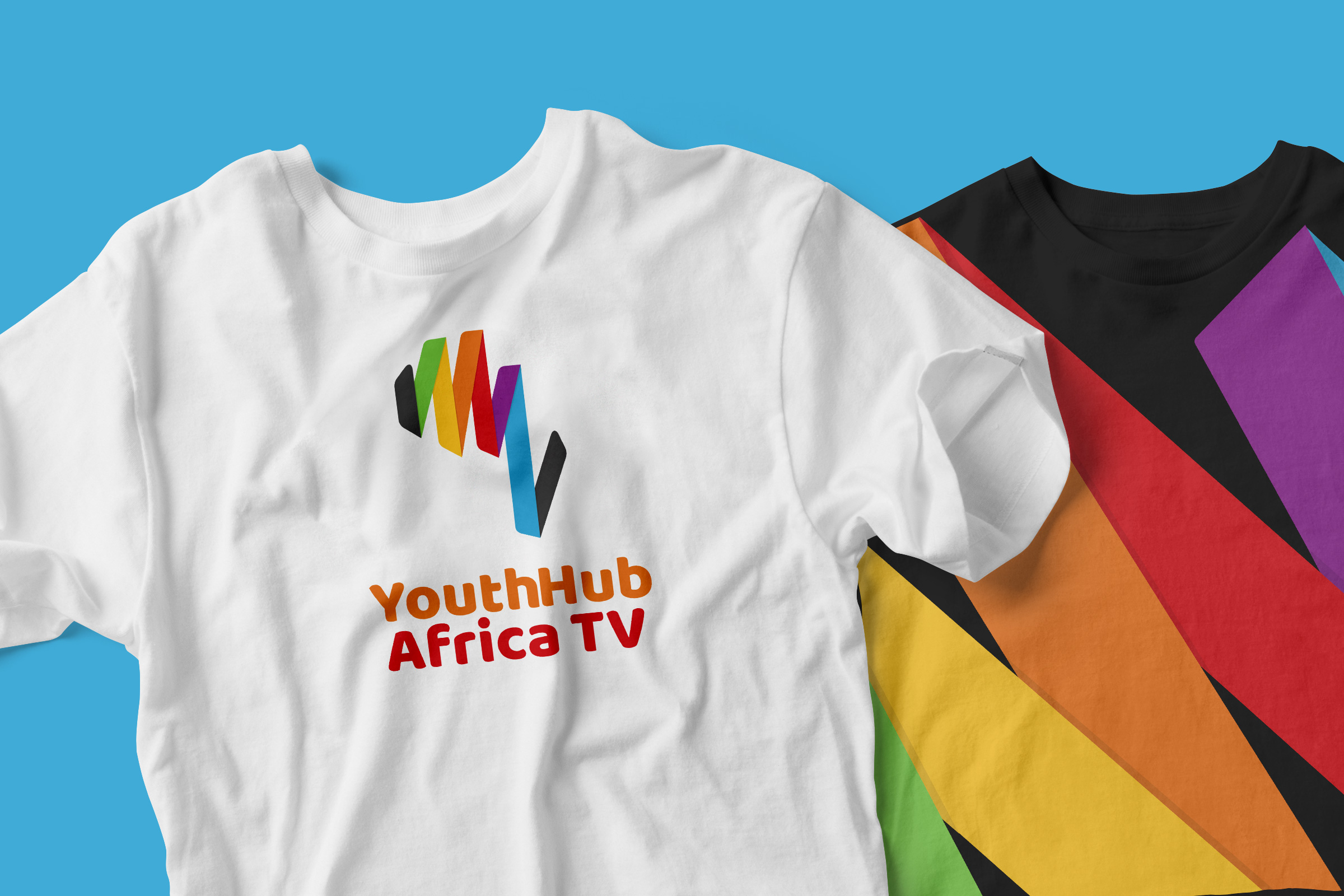
We created a logo that drew inspiration from the color and symbol of the main YouthHub Africa brand. This logo also draws inspiration from specific related contexts (described below) and weaves them into a lively and dynamic form which alludes to the main brand, yet is distinct and able to stand confidently on its own.
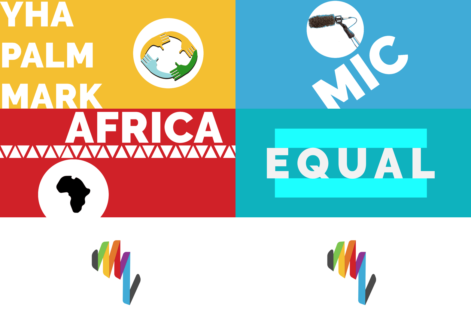
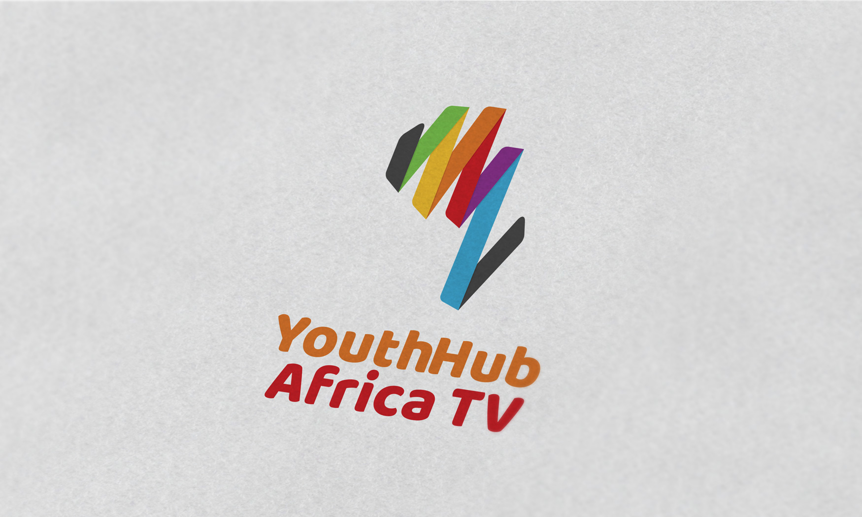
On inspection you will see that the specific related contexts are sound waves, the five-fingered palm facing up, the TV static colors as well as positions, a microphone and most importantly, Africa.
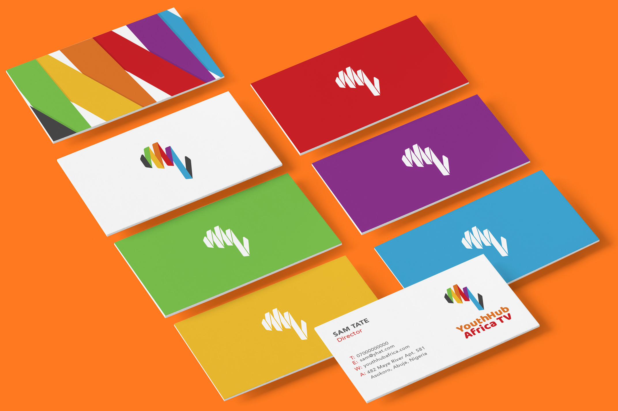
To balance all these contexts, we extracted the core identity of each one. The resulting overlap of these identities produces a logomark that carries a widespread message in a minimal and direct manner.
Approach
We created a logo that drew inspiration from the color and symbol of the main YouthHub Africa brand. This logo also draws inspiration from specific related contexts (described below) and weaves them into a lively and dynamic form which alludes to the main brand, yet is distinct and able to stand confidently on its own.
On inspection you will see that the specific related contexts are sound waves, the five-fingered palm facing up, the TV static colors as well as positions, a microphone and most importantly, Africa.
To balance all these contexts, we extracted the core identity of each one. The resulting overlap of these identities produces a logomark that carries a widespread message in a minimal and direct manner.
Elements
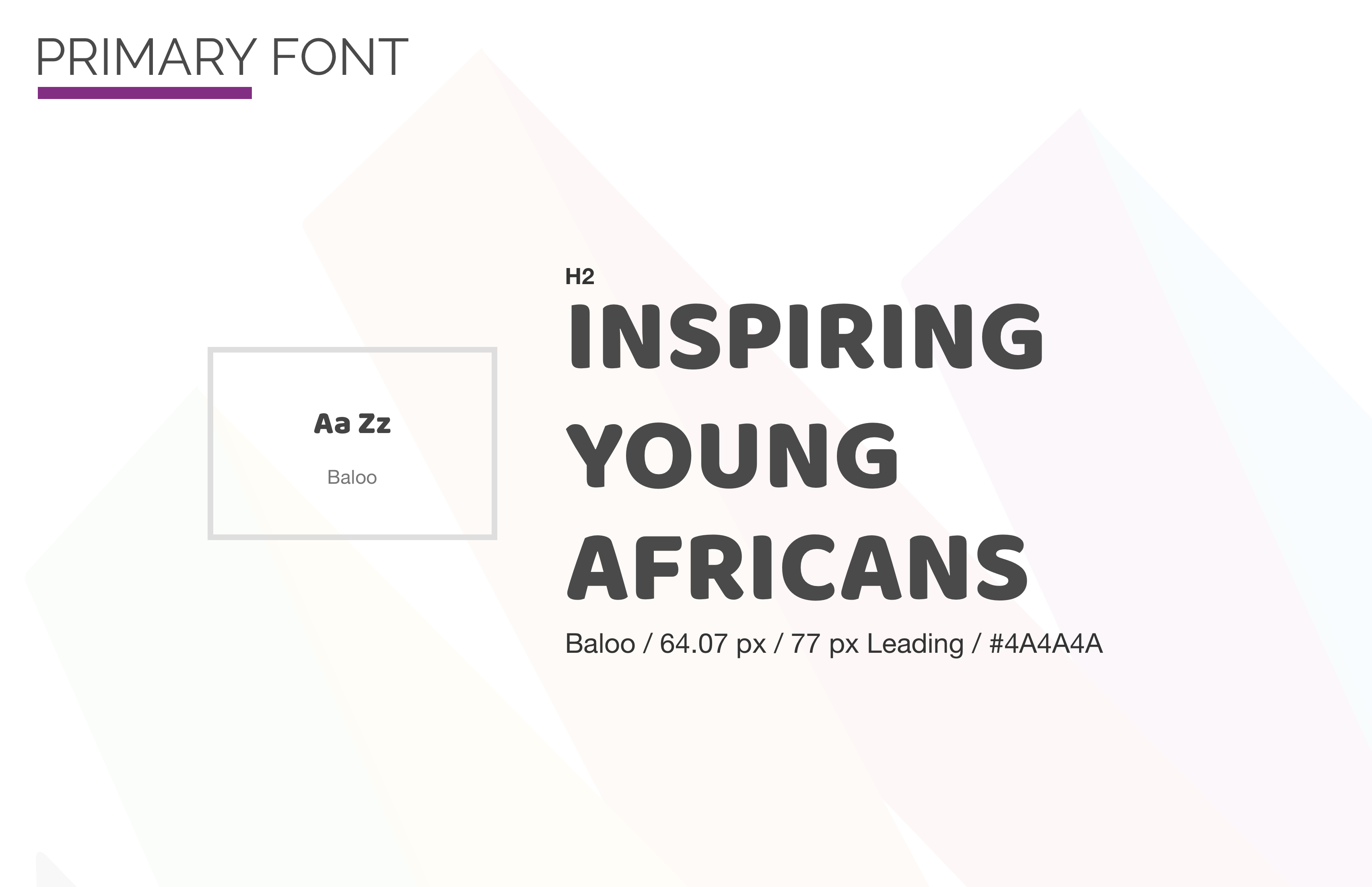
The typeface we chose for the identity is Baloo, an affable display typeface by Ek Type that embodies a perfect blend of pointy paws and a subtle tinge of playfulness. This gives it a carefree yet confident, warm yet entertaining, sprightly yet intelligible form that exudes life and compliments the logomark.
Elements
The typeface we chose for the identity is Baloo, an affable display typeface by Ek Type that embodies a perfect blend of pointy paws, a subtle tinge of playfulness and all the bare necessities of type. This gives it a carefree yet confident, warm yet entertaining, sprightly yet intelligible form that exudes life and compliments the mark.